Have you ever struggled to align items in a webpage? Maybe you wanted to center a button, place cards side by side, or evenly space navigation links. If that sounds familiar, CSS Flexbox is exactly what you need to learn.
In this guide, CSS Flexbox Explained with Simple Examples, you’ll discover how Flexbox works, why it’s so popular, and how to use it to build modern, responsive layouts without complicated CSS. By the end, you’ll be able to align elements with confidence.
What Is CSS Flexbox?
CSS Flexbox, short for Flexible Box Layout, is a layout system designed to arrange elements efficiently inside a container. It makes it easy to align, distribute, and resize items, even when the screen size changes.
Before Flexbox, developers relied on floats and complicated positioning techniques. Flexbox simplifies the process by giving you powerful alignment tools with just a few CSS properties.
Think of a Flexbox container as a row or column that automatically organizes its child elements.
Why Learn CSS Flexbox?
Flexbox is one of the most useful CSS features because it solves many common layout problems.
Here are some everyday uses:
- Centering content horizontally and vertically
- Creating navigation bars
- Building responsive card layouts
- Aligning buttons
- Creating pricing tables
- Organizing forms
- Designing dashboard layouts
Once you understand Flexbox, creating clean layouts becomes much faster.
Understanding the Flex Container
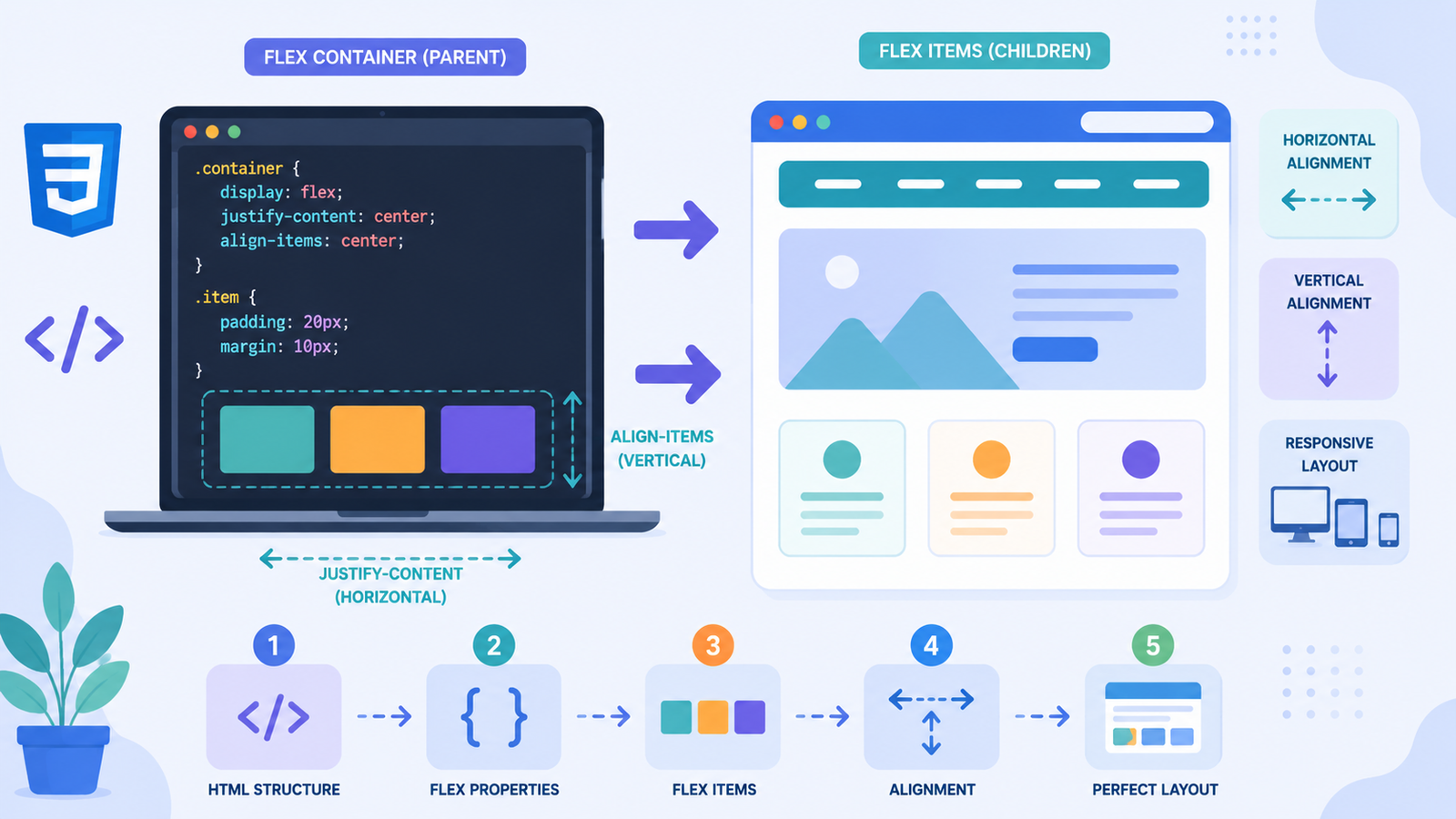
Every Flexbox layout begins with a container.
Here’s a simple HTML example:
“`html id=”b8k2mx”
Box 1
Box 2
Box 3
Now make the container flexible.css id=”h3r9wd”
.container {
display: flex;
}
That's it!

The three boxes will automatically line up in a row.

The parent element becomes the **flex container**, while each child becomes a **flex item**.

## CSS Flexbox Direction Explained

By default, Flexbox arranges items horizontally.
css id=”n5p7ya”
.container {
display: flex;
flex-direction: row;
}
If you want items stacked vertically:css id=”w2f8jc”
.container {
display: flex;
flex-direction: column;
}
### Flex Direction Options

* `row`
* `row-reverse`
* `column`
* `column-reverse`

Changing one property completely changes the layout.

## Align Items with CSS Flexbox

One of the biggest advantages of Flexbox is simple alignment.

### Horizontal Alignment

Use `justify-content`.
css id=”j9v6ke”
.container {
display: flex;
justify-content: center;
}
Other useful values include:

* `flex-start`
* `flex-end`
* `center`
* `space-between`
* `space-around`
* `space-evenly`

These options control spacing along the main axis.

### Vertical Alignment

Use `align-items`.
css id=”m6x4zt”
.container {
display: flex;
align-items: center;
}
This aligns items along the cross axis.

Combining both properties lets you center almost anything.
css id=”c1d5pl”
.container {
display: flex;
justify-content: center;
align-items: center;
}
Many developers use this technique daily to center buttons, login forms, and images.

## CSS Flexbox with Simple Examples

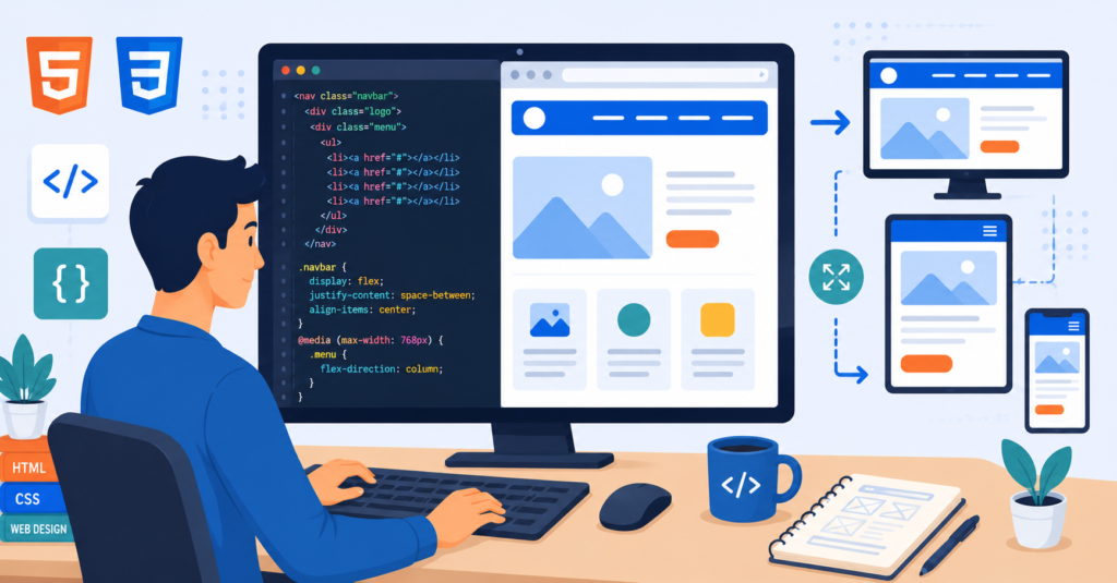
Let's build a simple navigation bar.

### HTML
html id=”f7n1qu”HomeAboutBlogContact
### CSScss id=”g4e8rv”
.menu {
display: flex;
justify-content: space-between;
align-items: center;
}
The links automatically spread across the navigation bar with equal spacing.

This is much easier than older layout methods.

## Creating Responsive Cards

Flexbox is also perfect for card layouts.

HTML:
html id=”k2m8bx”
Card 1
Card 2
Card 3
CSS:css id=”v5t3qn”
.cards {
display: flex;
gap: 20px;
}
The `gap` property creates consistent spacing between cards without using margins.

It's simple, clean, and easy to maintain.

## Understanding Flex Grow

Sometimes one element should take more space than others.

Example:
css id=”u4k7sh”
.box1 {
flex-grow: 2;
}
.box2 {
flex-grow: 1;
}
The first box grows twice as much as the second one.

This is useful for dashboards and content layouts.

## Understanding Flex Wrap

What happens if there isn't enough room?

Normally, items stay on one line.

To allow wrapping:
css id=”d9w2fa”
.container {
display: flex;
flex-wrap: wrap;
}
Now items automatically move to the next row when needed.

This makes your layout more responsive on smaller screens.

## Common Beginner Mistakes

Everyone makes a few mistakes while learning Flexbox.

Here are the most common ones.

### Forgetting `display: flex`

Without this property, none of the Flexbox features work.

Always start with:
css id=”q8z6lm”
display: flex;
“`
Using Alignment on the Wrong Element
Remember:
justify-contentbelongs on the container.align-itemsbelongs on the container.
Applying them to child elements won’t have the expected effect.
Mixing Up Row and Column
Beginners often forget that changing flex-direction changes the main axis.
Understanding the main axis and cross axis makes alignment much easier.
Practical Tips for Learning Flexbox
Here are a few habits that can speed up your learning.
- Build small layouts every day.
- Experiment with each Flexbox property individually.
- Resize your browser window to see responsive behavior.
- Practice creating navigation bars and card layouts.
- Use browser developer tools to inspect Flexbox containers.
One helpful exercise is creating the same layout in multiple ways. You’ll quickly understand which Flexbox properties work best for different situations.
What’s Next After Flexbox?
Flexbox is perfect for one-dimensional layouts, such as rows or columns.
Once you’re comfortable with it, consider learning CSS Grid.
While Flexbox organizes elements in one direction, Grid handles two-dimensional layouts with rows and columns.
Learning both gives you everything you need to build professional websites.
Final Thoughts
Learning CSS Flexbox Explained with Simple Examples is one of the biggest steps toward becoming a confident web developer. Flexbox removes much of the frustration from aligning elements and makes responsive design significantly easier.
The best way to master Flexbox is through practice. Build navigation bars, photo galleries, pricing cards, and landing page sections using the properties you’ve learned today. The more layouts you create, the more natural Flexbox will feel. Open your code editor, experiment with different alignment options, and if you build something you’re proud of, share it in the comments and keep improving your web development skills.