A navigation bar is one of the first things visitors notice when they land on a website. It helps users move between pages quickly and gives your site a professional appearance. If you’re learning web development, building a responsive navigation bar is an excellent beginner project.
In this guide, How to Build a Responsive Navbar with HTML & CSS, you’ll learn how to create a simple navigation bar that looks great on desktops, tablets, and smartphones. We’ll go through each step with easy-to-follow code examples so you can build your own responsive navbar from scratch.
What Is a Responsive Navbar?
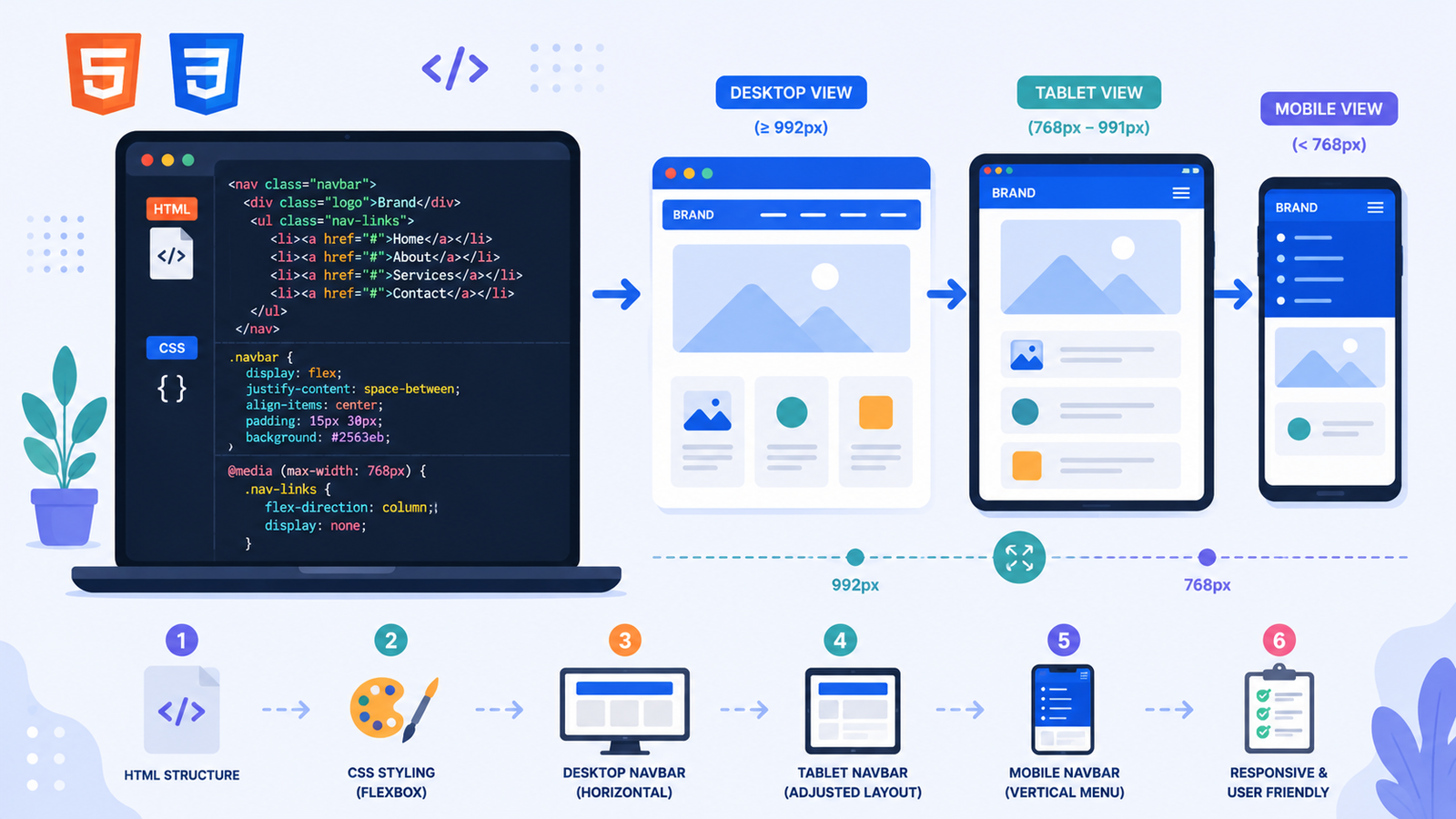
A responsive navbar is a navigation menu that automatically adjusts its layout based on the screen size. On larger screens, the menu items are displayed in a horizontal row. On smaller devices, the layout changes to fit the available space, making the website easier to use.
Responsive navigation is an important part of modern web design because users visit websites from many different devices.
Why Learn to Build a Responsive Navbar?
Creating a responsive navigation bar teaches several essential web development skills.
You’ll practice:
- Structuring content with HTML
- Styling elements using CSS
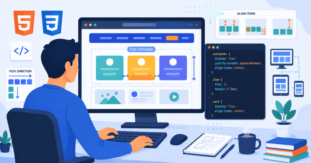
- Using Flexbox for alignment
- Working with media queries
- Building mobile-friendly layouts
These techniques are used in almost every professional website.
Project Setup
Create two files in the same folder:
index.htmlstyle.css
Keeping your HTML and CSS separate makes your project easier to organize and maintain.
Step 1: Create the HTML Structure
Start by adding the basic navigation markup.
“`html id=”k4z8tm”
Responsive Navbar
MySite
This creates a logo and four navigation links.

## Step 2: Style the Navbar with CSS

Now add some basic styling.
css id=”r7p2vc”
body {
margin: 0;
font-family: Arial, sans-serif;
}
.navbar {
display: flex;
justify-content: space-between;
align-items: center;
background: #1f2937;
padding: 15px 30px;
}
.logo {
color: white;
font-size: 24px;
font-weight: bold;
}
.nav-links {
display: flex;
list-style: none;
gap: 20px;
}
.nav-links a {
color: white;
text-decoration: none;
}
The `display: flex` property aligns the logo and navigation links neatly in a single row.

## Understanding CSS Flexbox in the Navbar

Flexbox makes alignment simple.

Here are the key properties used:

* `display: flex` creates a flexible container.
* `justify-content: space-between` separates the logo and menu.
* `align-items: center` vertically centers everything.
* `gap` adds equal spacing between menu items.

These few properties replace older, more complicated layout techniques.

## Step 3: Make the Navbar Responsive

Next, add a media query.
css id=”n6y4bh”
@media (max-width: 768px) {
.navbar {
flex-direction: column;
}
.nav-links {
flex-direction: column;
margin-top: 15px;
text-align: center;
}
}
Now, when the screen becomes narrower than 768 pixels, the navigation links stack vertically.

This makes the menu easier to use on phones and tablets.

## How Responsive Design Works

Responsive design uses CSS media queries to apply different styles depending on the device width.

For example:

* Desktop → Horizontal navigation
* Tablet → Adjusted spacing
* Mobile → Vertical menu

The same HTML remains unchanged while CSS adapts the layout automatically.

This approach keeps your code clean and reusable.

## Complete Responsive Navbar Code

Your finished project combines HTML and CSS to create a clean, responsive navigation bar.

Features include:

* Horizontal desktop layout
* Vertical mobile layout
* Flexible spacing
* Clean typography
* Simple, beginner-friendly code

Once you've completed this project, you'll have a reusable navigation component for future websites.

## Ways to Improve Your Navbar

After creating the basic version, try adding more features.

Some ideas include:

* Hover animations
* Smooth color transitions
* A sticky navigation bar
* Rounded buttons
* Icons beside menu items
* A mobile hamburger menu using JavaScript

These improvements make your project look more professional while helping you practice additional CSS and JavaScript skills.

## Common Beginner Mistakes

Everyone runs into a few issues when building their first navigation bar.

Here are the most common ones.

### Forgetting to Link the CSS File

Always check that your stylesheet is connected correctly.
html id=”t5j9qx”
Without this line, your webpage will display only plain HTML.

### Missing Flexbox

If you forget:
css id=”d2w7kf”
display: flex;
your navigation links will stack by default instead of appearing in a row.

### Incorrect Media Query

Be careful with your breakpoints.

For example:
css id=”c8n1sz”
@media (max-width: 768px)
A small typing mistake can prevent responsive styles from working.

### Forgetting Viewport Settings

For responsive layouts, include the viewport meta tag.
html id=”p3x6ra”
“`
Without it, mobile devices may not display the layout correctly.
Practical Tips for Learning Responsive Design
Responsive design becomes easier with practice.
Here are a few helpful habits:
- Resize your browser while coding.
- Test your website on multiple screen sizes.
- Keep your CSS organized with comments.
- Practice using Flexbox before learning Grid.
- Build several small navigation bars with different styles.
One useful exercise is recreating the navigation bars from your favorite websites. You’ll discover how professionals organize layouts and apply spacing effectively.
What’s Next After This Project?
Once you’ve mastered a responsive navbar, you’re ready to explore more advanced web development topics.
Consider learning:
- CSS Grid
- JavaScript hamburger menus
- Dropdown navigation
- Sticky headers
- CSS animations
- Responsive landing pages
Each project builds naturally on the skills you’ve learned here.
Final Thoughts
Learning How to Build a Responsive Navbar with HTML & CSS is an important milestone for every beginner web developer. This project introduces HTML structure, CSS styling, Flexbox alignment, and responsive design principles in a practical way that you’ll use again and again.
The best way to improve is by experimenting with your own designs. Change the colors, fonts, spacing, and layout until you create a navigation bar that matches your style. Every small project strengthens your skills and prepares you for larger web development challenges. Open your code editor, build your own responsive navbar today, and if you create a unique design, share it in the comments and keep learning.